React applications look modern and better. However, creating it can take months. Even though it is cost-effective, many choose to back off. But now with top React component libraries, you don’t have to.
React UI libraries offer pre-built components and blocks. So, you can focus on building the app, not the design. Also, many libraries have responsive components, customizable themes, and a Figma UI kit. Therefore, you can build a professional and consistent application.
In this blog, I will share the best React UI component libraries for 2026. Although there are many UI libraries, the following 15+ React UI libraries caught my attention. So, let’s take a look and help you choose which one you need.
Best React Component Libraries 2026
Here are the best React UI libraries I found. With pre-built components and easy customization, you can build any application quickly.
Mantine UI
Mantine UI is another popular React UI component library now. It is a simple library with 123 responsive components. Moreover, the library is built with Mantine to easily create complex web applications.
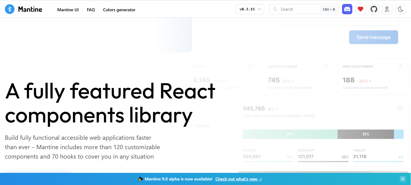
Furthermore, Manitne UI highly focuses on the developer experience and accessibility. You can simply build complex interfaces with less code. Along with the strong TypeScript support, Mantine is ideal for both small and large-scale projects.
Key Features
- Open‑source React UI component library
- Extensive collection of responsive UI components
- Built with accessibility and usability in mind
- Powerful theming system with dark mode support
- Complete form components and validation tools
- Utility hooks for notifications, modals, and state
- Strong TypeScript support
- Ready for modern React workflows
Pros
- Broad component coverage
- Highly customizable with themes
- Built‑in UI utilities like hooks and notifications
- Works well for complex React applications
Cons
- Larger learning curve than basic UI kits
- Styles may feel opinionated for some projects
- Not as lightweight as simpler libraries
GitHub Star: 30.6K
GitHub Repository: mantinedev/mantine
Tailgrids UI
Tailgrids UI is an open-source, best-in-class React UI component library. It has 600+ high-quality components and pre-built blocks. Tailgrids UI is built using Tailwind CSS and a TypeScript-first React component architecture.
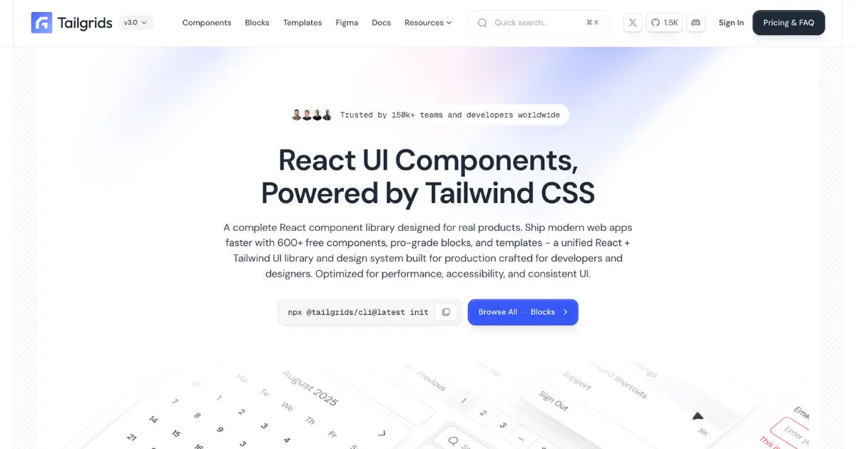
Therefore, Tailgrids 3.0 React components are modern, clean, and easy to work with. The components go well with React, Next.js, and other frameworks as well. Plus, the components are fully responsive. It has read-to-copy React and Tailwind codes as well.
Key Features
- Modern React UI component library with a structured design system
- Built for fast development and modern workflows
- 600+ free and Pro UI components available
- Large collection of ready-to-use UI components and blocks
- 100+ free components included
- 500+ Pro blocks for advanced projects
- Supports TypeScript with JSX and TSX
- Ideal for modern React development environments
- Fully responsive components for all screen sizes
- Ready-to-copy production-quality code
- Clean code structure for scalable applications
- Updated for long-term project growth
- Consistent UI built with Tailwind CSS and design tokens
- Free SVG icon library works with Tailgrids, Tailwind CSS, React, and Figma
- Tailgrids Figma Kit with 900+ styles
- 8+ customizable React UI templates
Pros
- Huge UI component library
- Modern, open-source, and ready-to-copy code elements
- Responsive and easily customizable UI components
- Built with Typescript-first architecture for React and Tailwind CSS
- Flexible and easily scalable
- Open-source SVG icon library and Figma Design Kit
- Best for updated designs and modern React applications
- Seamless design in even dark mode.
Cons
- Needs Tailwind CSS for better customization
GitHub Stars: 1.5K
Github Repository: Tailgrids/Tailgrids
Material UI
Material UI is another open-source and one of the best React UI component libraries. It offers predefined UI components for React. The library is based on Google’s Material design. The library has a good collection of professional UI elements.
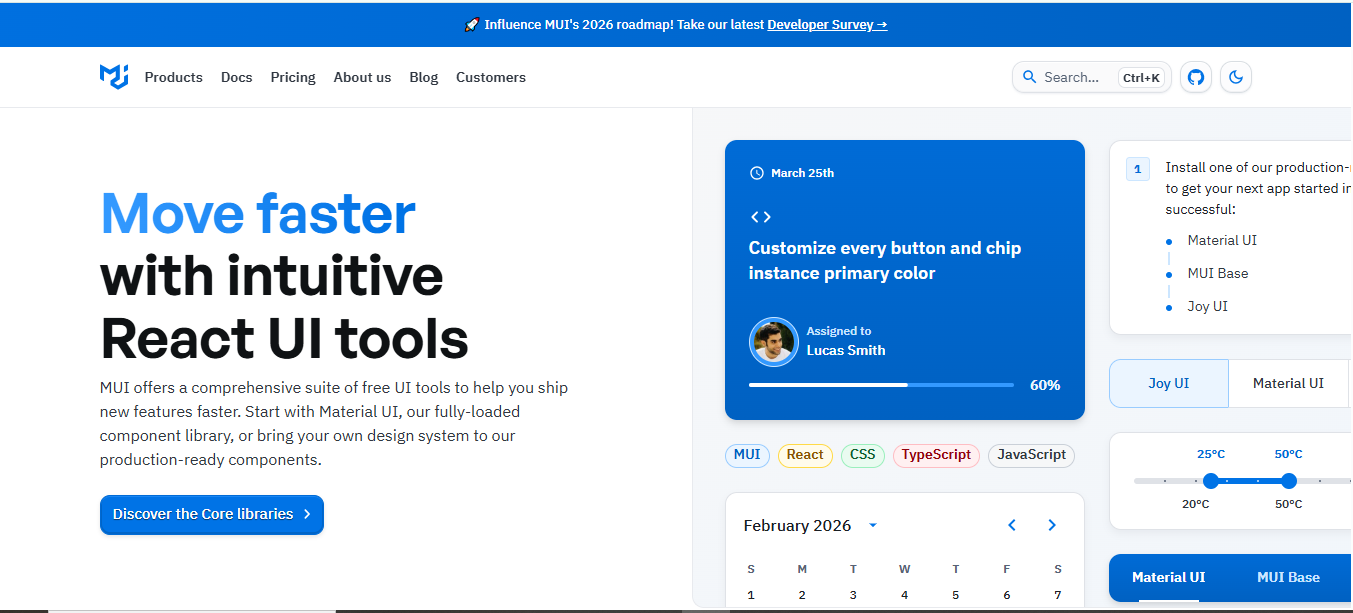
Further, the Material UI components are customizable and fully responsive. It also offers the Figma design kit and has ready-to-build UI templates.
Key Features
- Open-source and modern React UI component library
- Based on Google’s Material Design
- Clean, modern, and consistent UI elements
- Ready-to-use templates and examples
- Works seamlessly with modern React frameworks
- Different templates to build any React project easily
- Easy-to-customize templates and UI components
- Built for speed and faster development
Pros
- Large and well-maintained component library
- Strong community and regular updates
- Highly customizable theming system
- Easy documentation and developer resources
- Supports TypeScript for scalable development
Cons
- Customization may require learning the system
- Some advanced components are in paid plans only
- Material Design style may not suit your project and design direction
GitHub Star: 97.9K
GitHub Repository: mui/material-ui
Untitled UI
Untitled UI is a popular and one of the best React UI component libraries for 2026. It is a comprehensive Figma UI kit, too. Along with that, Untitled UI has a good collection of UI elements. Moreover, the components are built with TypeScript and React Aria and styled with Tailwind CSS.

With the copy-paste codes, you can build any project easily and quickly. Together with the custom CLI, you can add the components effortlessly through a single command.
Key Features
- Large and modern UI design system
- One of the biggest Figma UI kits available
- Thousands of UI components and layouts
- Built with Tailwind CSS and TypeScript
- React component library for modern web apps
- Consistent design system across design and code
- Fully responsive and accessible components
- Extensive icons and UI elements library
- Ready-to-use sections and product UI blocks
Pros
- Strong alignment between Figma and React components
- Speeds up both design and development workflows
- High-quality UI components and elements
- Helps maintain consistent product design
Cons
- A large design system may feel complex for beginners
- Requires familiarity with modern tools like Figma and React
- Some teams may need time to adapt to the full system structure
GitHub Star: 1.6K
GitHub Repository: untitleduico/react
Align UI
Align UI is another of the best React UI component libraries, and the Figma UI kit. It is also a modern and open-source UI library. So, you can easily build any of your React projects without any hassle. Align UI uses React and Tailwind CSS. Also, it includes 180+ UI components and a Figma kit for seamless UI/UX design.
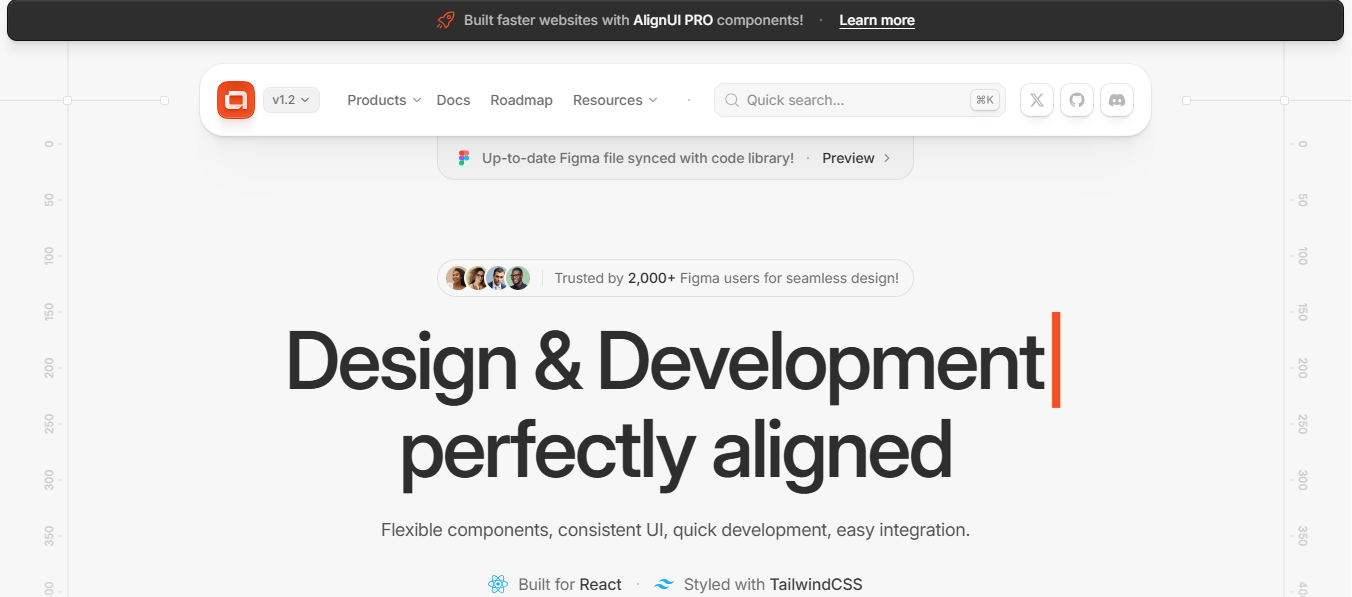
Another with, Align UI elements are flexible and easily customizable. Furthermore, the library offers multi-page user flows for different apps. The simple workflows let you build any of your designs easily.
Key Features
- 180+ UI elements with 40+ free components
- Built for React and styled with Tailwind CSS
- Comprehensive Figma design kit for consistent design
- Production and copy-paste-ready code for rapid development
- Fully responsive and flexible UI elements
- Customize the themes, typography, color, and border radius
- Strong TypeScript support for easily maintainable code
- Sector-specific templates and ready-made UI flows
- Supports dark mode and WCAG accessibility standards
Pros
- Modern design system with React and Tailwind CSS
- Has both the Figma design kit and real code components
- Flexible and customizable UI elements
- Speeds up UI design and development workflow
- Good option for SaaS apps and dashboards
- Supports scalable and maintainable development
Cons
- Smaller ecosystem compared to major UI libraries
- Some advanced features are available in paid versions only
- Limited community resources compared to older libraries
GitHub Star: 37
GitHub Repository: alignui
Chakra UI
Chakra UI is another open-source React UI component library. It provides a wide range of UI components for building modern applications. The library prioritizes adaptability and simplicity. That’s why it comes with Composable APIs and better accessibility. The elements are easy to customize.
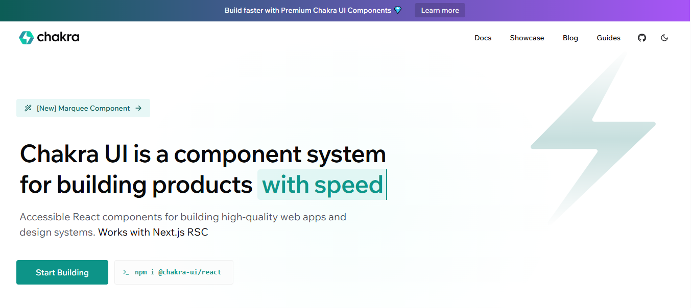
So, you can easily change the colors, typography, and theme. It allows you to make your design and project seamless. Not only that, the UI library has built-in dark mode support and a highly themeable structure as well. Furthermore, Chakra UI has a strong community for any updates or help.
Key Features
- Open-source and simple React UI component library
- Wide collection of modern UI components
- Composable APIs for flexible development
- Supports strong WAI-ARIA standards
- Fully responsive for any device
- Elements are easy to customize
- Built in dark-mode support
- Highly themeable design
Pros
- Clean and modern component design
- Strong accessibility support
- Highly customizable design system
- Active community and regular updates
Cons
- Works only with React-based projects
- Smaller ecosystem compared to some larger UI libraries
- Advanced customization may take time to get
GitHub Star: 40.3K
GitHub Repository: chakra-ui/chakra-ui/
React Aria Components
React Aria is another UI component library for React. It is an unstyled UI library and focuses on ARIA accessibility. It is built by Adobe. In addition to that, the library offers accessible UI primitives and hooks. Thus, you can build complex and inclusive React applications easily.
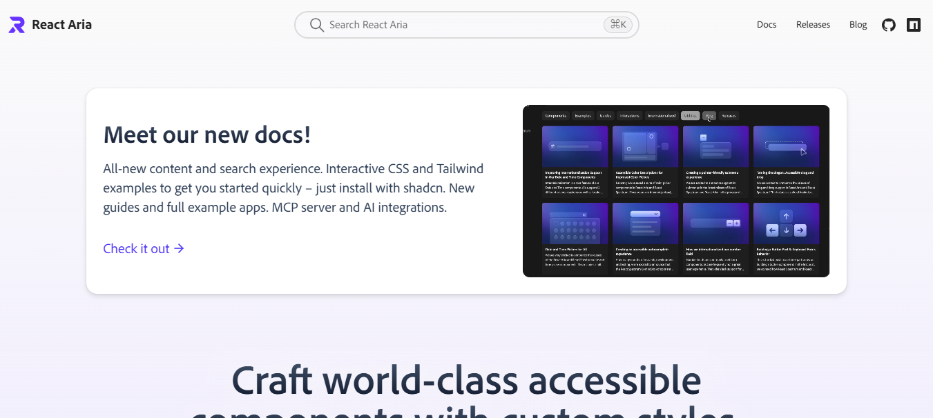
Together with that, the UI components are designed with the Compositional API. Hence, you can combine small UI parts to create complex or custom elements. It also supports flexible and scalable APIs. So, you can simply customize the design as you want. Besides, the library has built-in support for over 30 languages with rich interactions.
Key Features
- Open‑source and modern React UI library by Adobe
- Provides accessible UI primitives and hooks
- Focuses on functionality, not visual design
- Manages keyboard interactions and focus behavior
- Built‑in ARIA support for full screen reader and keyboard navigation
- Works with any styling system, including Tailwind and CSS
- Helps build custom, accessible UI components
- Optimized for high-quality interactions for all devices
- Has built-in DOM structure and a simple styling API.
Pros
- Strong accessibility support out of the box
- Full control over design and styling
- Works with any visual framework
- Lightweight and modular
- Great for custom design systems and component libraries
Cons
- No pre‑styled UI components included
- Requires more work to design visuals
- Not ideal if you need ready‑made designs quickly
- Beginners may need time to understand accessibility concepts
GitHub Star: 14.8K
GitHub Repository: adobe/react-spectrum
Fluent React
Fluent UI React is another advanced UI component library. It is an official open-source JavaScript front-end framework by Microsoft. Moreover, the library provides reusable UI components for building responsive applications. The components are modern and easy to customize as well. So, you can build any React project with a smooth and seamless design.
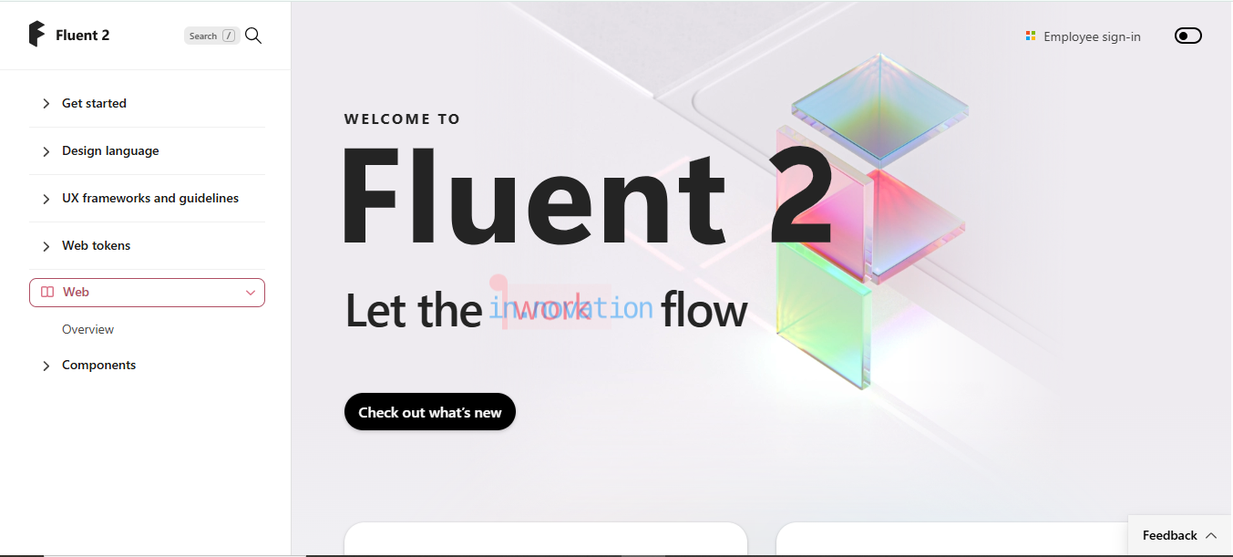
Another example of that is Fluent UI, which follows its design system approach. In this way, it ensures the designs are consistent and easy to maintain. The library follows Microsoft’s Fluent Design principles for scalable and accessible design.
Key Features
- Open-source UI component library developed by Microsoft
- Built for React applications and modern web development
- Follows Microsoft’s Fluent Design System
- Wide range of ready-to-use UI components
- Token-based theming and customization system
- Built-in accessibility and keyboard support
- Consistent design across enterprise applications
- Offers scalable and maintainable UI architecture
- Easily accessible, consistent, and responsive components
Pros
- Better accessibility and design consistency
- Highly customizable theming system
- Works well for large and complex applications
- Active development and a strong ecosystem
Cons
- It can be complex for beginners to learn
- Design style may feel enterprise-focused only
- Some components require deeper React knowledge
- Smaller community tutorials compared to some popular UI libraries
GitHub Star: 19.9K
GitHub Repository: microsoft/fluentui
Ant Design React
Ant Design is an open-source, popular, and free React component library. It has many high-quality React UI components. Again, the code is written in TypeScript with statically typed interfaces. The library is built for enterprise-grade web applications. Also, it comes with the whole design and development tools package.
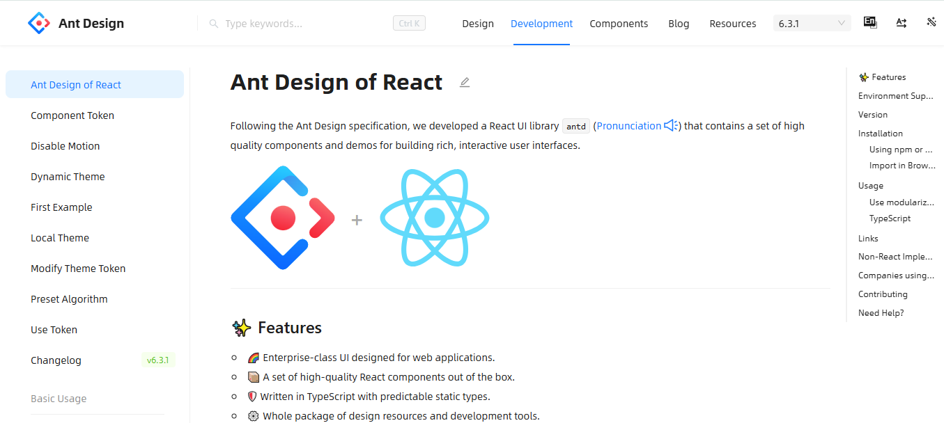
Along with the powerful customization, you can easily customize any detail you want. The components support CSS and flexbox. In addition, it follows a 24-aliquot grid system with adaptable, responsive design. It also supports multiple languages.
Key Features
- Open-source and widely used React UI component library
- Huge collection and variety of high-quality UI components
- Built with TypeScript for predictable static types
- Designed for enterprise-level applications
- Powerful theme and design customization options
- 24-grid system for responsive layouts
- Supports custom CSS and Flexbox layouts
- Built-in multiple language support
- Complete design and development toolkit
Pros
- Rich and professional component ecosystem
- Ideal for enterprise and large-scale applications
- Strong TypeScript support
- Highly customizable design system
- Active community and continuous improvements
Cons
- Has a learning curve for beginners
- Bundle size can be large for smaller projects
- Some customization requires deeper configuration
- May feel complex for simple applications
GitHub Star: 97.6K
GitHub Repository: ant-design/ant-design
Headless UI
Headless UI React is an unstyled and fully accessible UI component library. The components are built with Tailwind CSS. Additionally, the components are easily accessible for modern applications. Headless UI focuses more on functionality and accessibility. That means you get the core logic and better control.
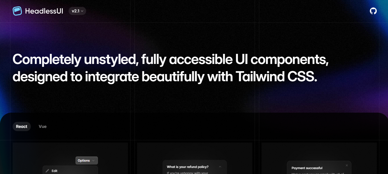
Moreover, the library is specially built for developers to build their own design system. With the built-in style, you can easily create a unique interface. However, Headless UI works with both React and Vue. If you are looking for the best Vue UI component libraries in 2026, you can consider this.
Key Features
- Open-source React UI component library
- Completely unstyled components for full design control
- Has built-in accessibility with ARIA support
- Integrate with Tailwind CSS
- Works with custom CSS or other frameworks
- Composable components for flexible UI building
- Lightweight and modular architecture
- Supports both React and Vue versions
Pros
- Full control over styling and design
- Accessibility handled automatically
- Works well with Tailwind-based projects
- Lightweight and performance-friendly
- Ideal for building custom design systems
Cons
- No pre-designed UI styles included
- Requires more styling work from developers
- Smaller component set compared to full UI frameworks
- Beginners may need time to understand headless components
GitHub Star: 28.4K
GitHub Repository: tailwindlabs/headlessui
However, if you are starting an e-commerce business, you can check out the Tailwind CSS E-commerce Templates. Many of the templates support React, Next.js, and other frameworks.
Daisy UI
Daisy UI is a popular Tailwind CSS plugin and pre-built React component library. It provides read-to-go UI components for Tailwind utility classes. For React, the library minimizes HTML verbosity. In this way, it offers faster development and easy styling. Again, the UI library supports multiple themes without adding JavaScript dependencies.
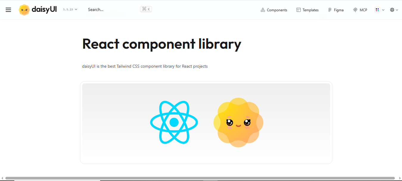
Together with that, the library helps developers switch styles or create their own. It also allows deeper customization and flexibility. Therefore, you can build the design and project as you want. The components are responsive and fit for any screen too.
Key Features
- Built on top of Tailwind CSS for easy integration
- Built-in theme system with multiple pre-designed themes
- Fully customizable with Tailwind utility classes
- Responsive elements, design, and modern layouts
- Uses readable class names for easier development.
- Built-in support for dark themes.
- Best for quick UI layouts and MVPs.
Pros
- Very easy to use with Tailwind CSS projects
- Speeds up UI development significantly
- Multiple themes available out of the box
- Highly customizable and flexible
Cons
- Requires Tailwind CSS to work properly
- Some advanced customization may still require manual styling
- Not as extensive as some large enterprise UI libraries
GitHub Star: 40.3K
GitHub Repository: saadeghi/daisyui
Tailwind Plus
Tailwind Plus, also known as Tailwind UI, is a premium React component library. It is created by the makers of Tailwind CSS. Also, the library includes 500+ UI blocks for web apps or any project. However, Tailwind Plus is not only a rigid UI kit, but it is more likely a blueprint pattern.
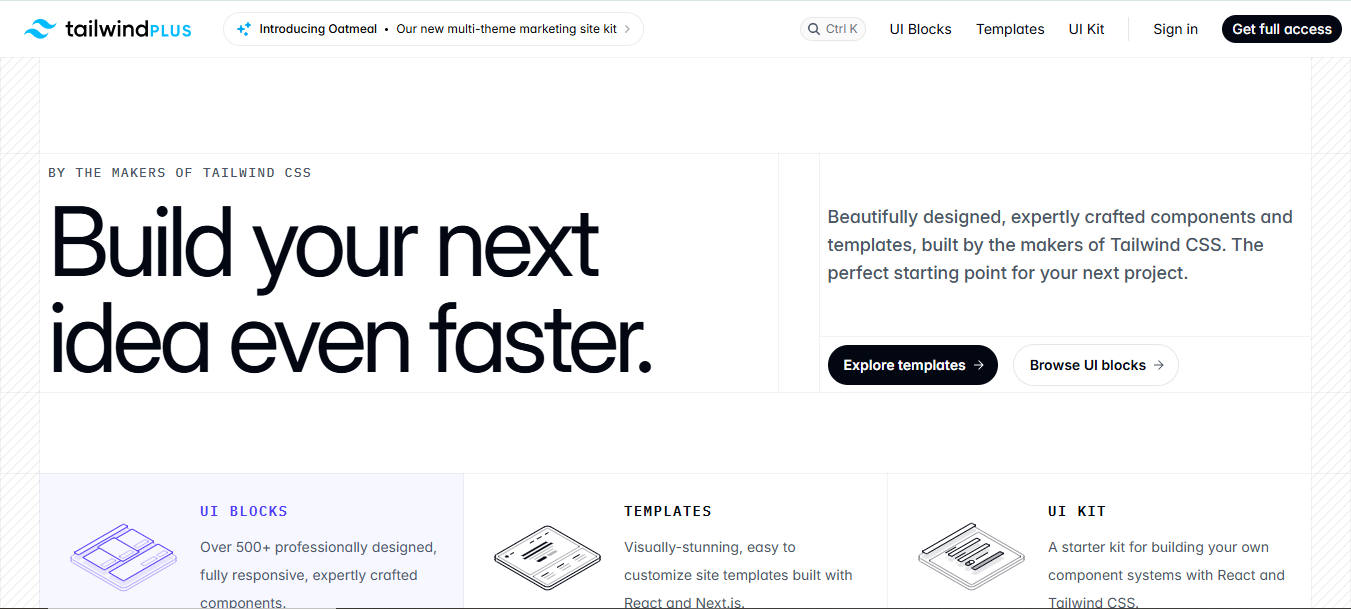
Moreover, Tailwind Plus is a complete UI solution. It has a full growing collection of UI elements and a UI kit called Catalyst. You can customize the components as you like. It improves design consistency and helps you build faster.
Key Features
- 500+ ready-to-use UI blocks
- Website templates for React and Next.js
- Has a Starter component kit called Catalyst UI Kit
- Works with React, Vue, and plain HTML
- Compatible with the latest Tailwind CSS Components
- Responsive and customizable components
- Lifetime access with free updates
- Professional layouts for apps, marketing, and eCommerce
Pros
- Saves a lot of development time
- High-quality, professional designs
- Flexible for different frameworks
- Lifetime access with updates
- Easy to use in production projects
Cons
- Fully paid product
- No Figma or design files included
- Requires some Tailwind CSS knowledge
- Designs may feel basic without custom tweaks
GitHub Star: 93.8K
GitHub Repository: tailwindlabs/tailwindcss
Shadcn/ui
Shadcn UI is a popular and open-source UI component library for React. It is built using Tailwind CSS and Radix UI. Unlike other UI libraries, Shadcn doesn’t offer pre-built components and layouts. Yet, it provides customizable UI blocks. Therefore, you can build your own design easily. Furthermore, you can build different and interactive user interfaces with Tailwind’s utility classes. So, you will save time on common UI logic.
Another thing with that, since you can copy the code, you will always have full control to customize, maintain, and edit as your needs. The UI library is built for React and Next.js applications. However, it works well on Vite, Astro, Remix, and Laravel as well. However, you can check the Shadcn UI alternatives too, for better components and features.
Key Features
- Open-source and open code React UI component library
- Built with Radix UI and Tailwind CSS
- Offers fully customizable UI blocks, not pre-built components
- Fully responsive components for any device
- Supports React, Next.js, Remix, Astro, Vite, and Laravel
- Easy to copy, maintain, and use the code
- Utility class approach for flexible and scalable design
Pros
- Full control over styling and design
- Flexible and modular components
- Lightweight and performance-friendly
- Works well with custom design systems
- Ideal for developers familiar with Tailwind CSS
Cons
- Don’t have any pre-designed layouts
- Requires proper Tailwind CSS knowledge
- Needs more effort to build complete interfaces
- Beginners may find it harder to use
GitHub Star: 107K
GitHub Repository: shadcn-ui/ui
Base UI
Base UI is a comprehensive and popular UI component library for React projects. It is built by the creator of Radix and Floating UI. With the library, you can create better accessible and flexible user interfaces. Not only that, Base UI offers unstyled, headless components that are composable. Thus, it gives you full control over styling.
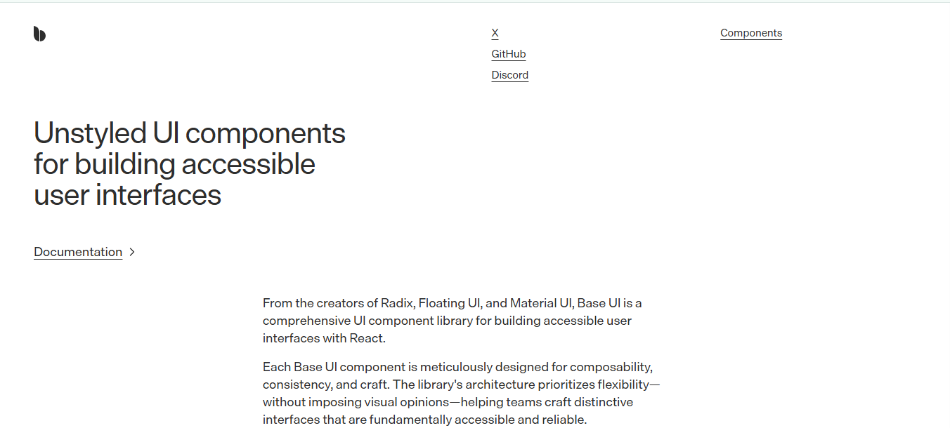
Moreover, Base UI makes cross-browser compatibility and event handling much easier. For this reason, developers can focus solely on design. It supports WAI-ARIA standards to handle complex details.
Key Features
- Open‑source, unstyled React UI component library
- Headless components with no built‑in CSS
- Accessibility first (WAI‑ARIA aligned)
- Composable APIs for flexible UI composition
- Works with CSS Modules, CSS‑in‑JS, and plain CSS
- Best for modern React workflows and hooks
- Broad browser support and predictable behavior
- Ideal for custom design systems and accessible interfaces
Pros
- Full control over component styling
- Accessibility handled automatically
- Good foundation for custom design systems
- Works with any styling framework
- Composable and flexible API
Cons
- No default visual styles
- Smaller ecosystem than some full UI libraries
- Requires more effort to create complete UIs
- Not ideal if you want pre‑styled components
GitHub Star: 8.7K
GitHub Repository: mui/base-ui
Hero UI
Hero UI is a fast and beautiful React UI library. It is a popular design system for modern React user interfaces. It is built with Tailwind CSS and React. The platform also has amazing ready-made components and layout blocks. The library still focuses on simplicity, flexibility, and consistent design.
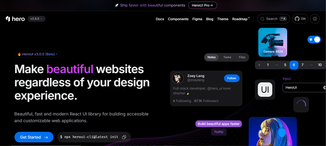
HeroUI is a highly themable UI library. That’s why it is easy to customize and even make big changes to meet your requirements. And you don’t have to write any heavy CSS. Furthermore, the library also includes complete UI pages. So, it improves your speed and efficiency.
Key Features
- Large collection of ready‑to‑use UI components
- Built with Tailwind CSS and React Aria
- Responsive and customizable UI elements
- Pre‑built page layouts for landing pages and dashboards
- Clean and modern visual design
- Copy-paste code and easily integrate into projects
Pros
- Speeds up UI development and design workflow
- Clean, modern, and consistent components
- Ideal for landing pages and marketing sites
- Easy to customize with utility classes
Cons
- Not a full framework, no JS behavior libraries
- Designed mainly for Tailwind CSS projects
- May require additional libraries for advanced UI interactions
- Smaller ecosystem compared to large UI libraries
GitHub Star: 28.2K
GitHub Repository: heroui-inc/heroui
React Bootstrap
React Bootstrap is another popular and open-source React UI component library. It uses the Bootstrap Front-end framework. However, it offers fully functional and native React components. In addition, the components integrate smoothly with React’s architecture. That’s why React Bootstrap components are efficient and well-integrated with the React ecosystem.
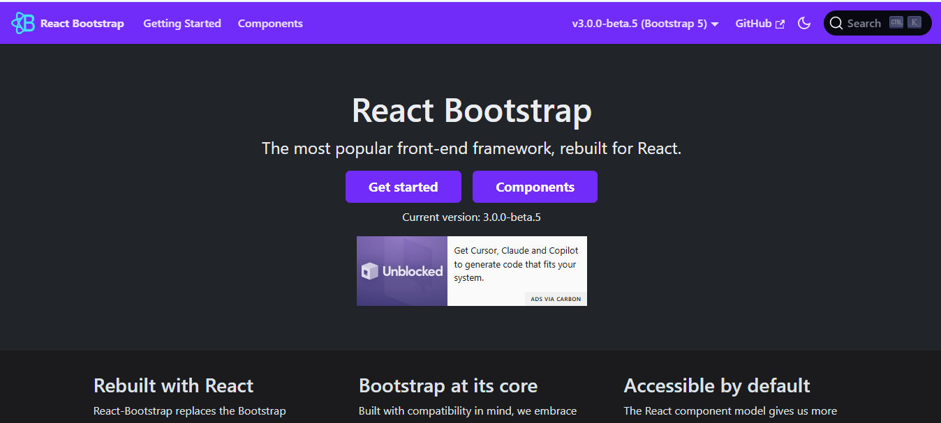
Moreover, React Bootstrap has well collection of pre-built UI components. Together, the UI components are scalable, responsive, and you can customize them simply. Hence, you can change the color, theme, and typography to make your design perfect.
Key Features
- Open-source React UI component library
- Bootstrap framework rebuilt specifically for React
- No dependency on jQuery or Bootstrap JavaScript
- Pre-built, reusable, and user-friendly UI components
- Works better with Bootstrap themes and styling
- Responsive grid system for better adaptability on any screen
- Components built using React state and props
- Accessible-by-default UI components
- Supports modern Bootstrap versions and utilities
Pros
- Easy for developers familiar with Bootstrap
- Large ecosystem of themes and templates
- Responsive design built into the system
- Reduces the need for manual UI styling
- Good documentation and community support
Cons
- Depends on Bootstrap styling conventions
- May feel less flexible compared to newer design systems
- Bundle size can increase in large projects
- Not ideal for projects that avoid Bootstrap design styles
GitHub Star: 22.6K
GitHub Repository: react-bootstrap/react-bootstrap
However, some developers are also choosing AI. You can easily build websites and applications with AI like Loveable. Yet, it has some drawbacks that make the app creation a little hassle. Check the Lovable alternatives to create better web applications.
How to Choose the React UI Library for Your Project
There is a huge list of different React UI component libraries. Choosing the right one also helps you build your projects efficiently. That’s why you need to look closely while selecting the library for your project. Here are the key factors you must look for in the library you are choosing:
- Consider your project type: Different projects definitely have different requirements. So, you need to choose the library carefully for your project type.
- Team size and experience level: Another factor to consider when choosing a library is your team size and experience. It allows your team to work smoothly without any lackings or learning curve.
- Design system requirements: Most importantly, check for the design requirements your project needs. If it’s a design-heavy project, you can go for updated libraries like Tailgrids.
- Performance priorities: Performance is also another key factor. Complex UI libraries can cause performance issues. On the other hand, lightweight libraries like Headless UI and Tailgrids UI optimize your projects for better speed and performance.
Final Words
React component libraries enable developers to significantly improve project quality. With the pre-made UI elements, you can create any small to complex projects in a very short time.
However, libraries such as Tailwind UI, Material UI, and Chakra UI are leading the market. The libraries offer better components, customization, and scalability. So, you can build modern and user-friendly interfaces. That’s why investing in the right UI library is a must. It makes building your React applications faster and easier.

