Cart is empty
Looks like you haven’t added anything to your cart yet
Cart is empty
Looks like you haven’t added anything to your cart yet

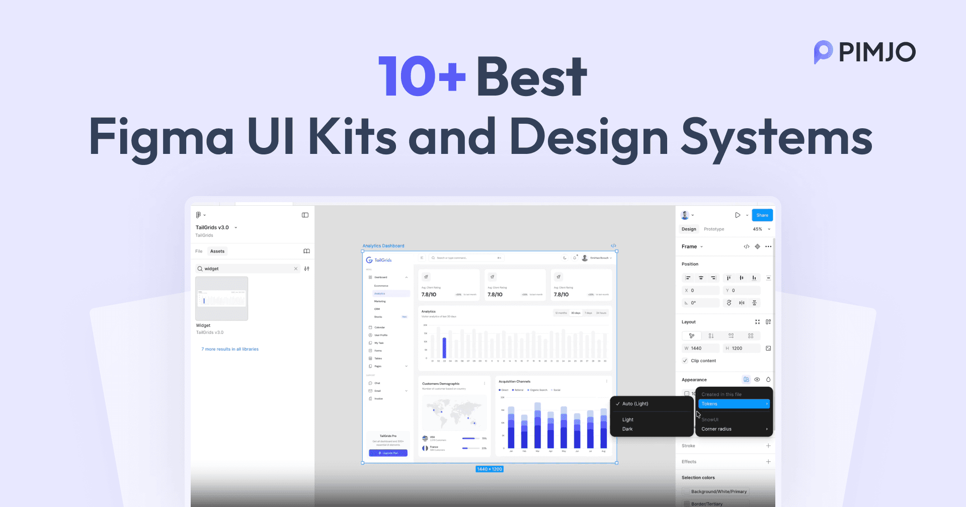
Looking for the best Figma UI kit and design system that 1:1 matches with React code?
You’re in the right place.
Most Figma UI kits for React look great in a preview. Clean component, nice color palette, Polished screenshots, but the moment your developer opens the file, the inconsistency shows up quickly.
Button variants don’t match the code. Colors are hardcoded instead of using Figma Variables. Spacing tokens are completely different from your Tailwind config. As a result, is that “seamless handoff” promise? Gone.
The real issue: most Figma UI kits are written for designers, not React developers. They rank kits by how pretty their previews look. Not by whether the components map to your actual codebase.
That gap costs teams real hours every single sprint.
In 2026, however, this problem is solved. The best Figma UI kits now ship with a matched React component library on the code side, Figma Variables replacing hardcoded styles, and 1:1 component naming so what designers build maps directly to what developers import.
We researched 11 of the best Figma design systems and UI kits available right now. To make this list, every kit had to meet three hard requirements:
Here’s exactly what you need to pick the right one for your stack.

Not every Figma UI kit is built for React developers. Most are built for designers who hand off to developers. That’s a different workflow entirely.
If you’re on a React team, here’s what actually matters.
A Figma file alone is not enough. The best kits give you a 1:1 matched React library on the code side. Same component names, same props, and same structure. When your designer builds a button in Figma, your developer should be able to import that exact button without rewriting anything.
Any kit still using static color styles in 2026 is already outdated. Figma Variables let you switch themes, toggle dark mode, and update your entire color system in one click. Without Variables, every theme change is manual work.
If your React/Next.js app runs on Tailwind CSS, your Figma kit should use the same token names and values. Same spacing scale and same color naming. This is what kills handoff friction at the source.
A kit last updated 2-3 years ago predates Auto Layout 5.0 and Figma Variables. That means extra work every time Figma ships a new release. Check the update history before committing.
Some kits charge per user, while others are one-time, lifetime purchases. Some are completely free. A $ 339-per-user kit makes sense for a 50-person enterprise team. It makes zero sense for a solo developer or a small startup.
These are the most reliable Figma UI kits available right now. Each one ships with a real React component library, supports Figma Variables, and has been updated in 2026.
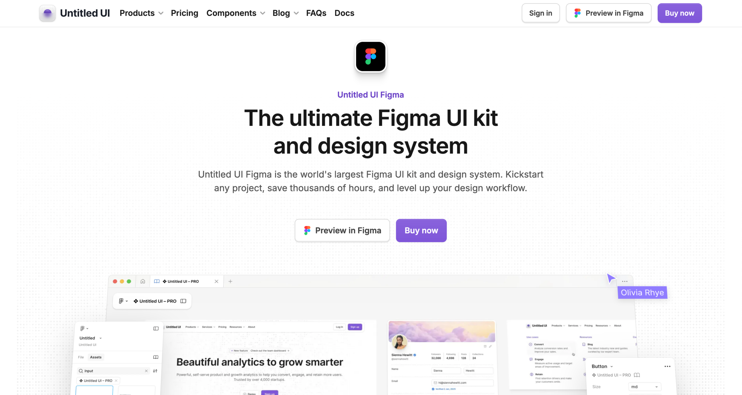
Untitled UI Figma is a popular Figma UI kit and design system, trusted by 320,000+ designers and with 850,000+ community downloads. It is created by Jordan Hughes and covers both the Figma design system and a matched React component library, maintained by the same team.
What you get on the Figma side:
What you get on the React side:
Free tier includes: 2,000+ components and variants, 350+ global styles, 20+ page examples, 900+ icons. No Figma Variables, no dark mode, no Auto Layout 5.0.
Pricing:
Best for: Any team building SaaS products, web apps, or marketing sites that want a single, mature source of truth across both design and React code.
Limitation: That said, the full library is massive. For smaller projects, Untitled UI ships PRO LITE, a 55% lighter version with 65+ page examples included free with every PRO purchase.
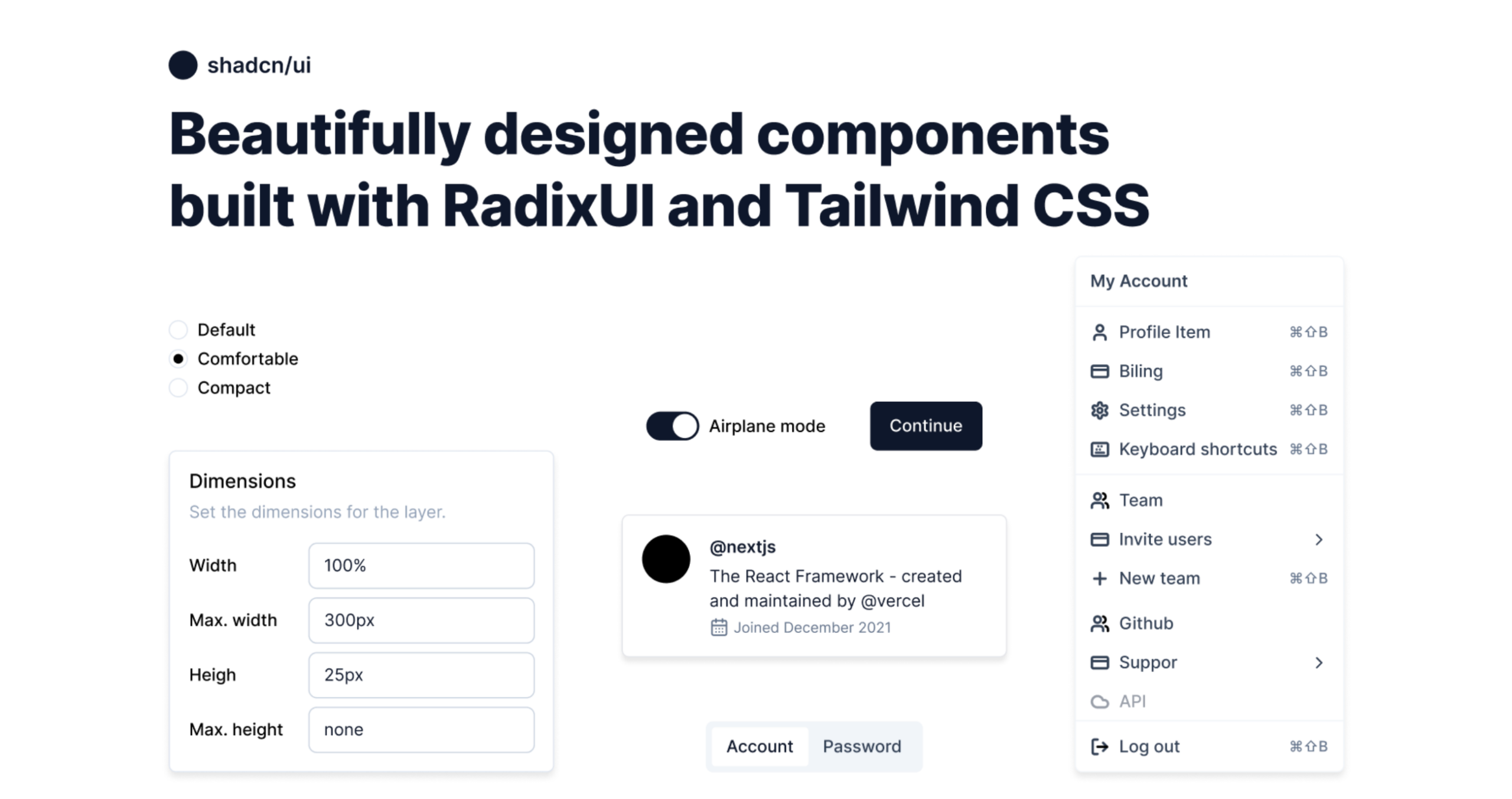
shadcn/ui is one of the most widely used React component libraries with 115,000+ GitHub stars. Every component is copied directly into your project, not installed as a package, which means you own the code fully. The official shadcn/ui docs link to multiple community-maintained Figma kits, both free and paid.
Free Figma kits:
Paid Figma kits:
What you get on the React side:
Pricing: Free community options available. Paid kits start from $119, depending on the option you choose.
Best for: Next.js and React teams already using shadcn/ui who want zero gap between Figma design and production code.
Limitation: The aesthetic is intentionally minimal. You bring your own brand on top. Also note: these kits are community-contributed, not built by the shadcn/ui core team.
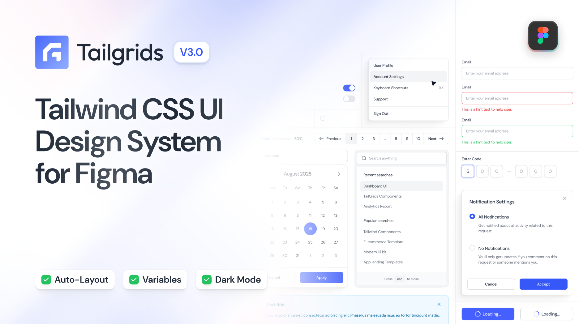
Tailgrids is a complete Figma UI kit and open-source React component library trusted by 150,000+ developers, designers, and teams worldwide, with 70,000+ designers using it on Figma Community. Both the Figma kit and the React library are built and maintained by the same team, giving you a unified system on both the design and code sides.
What you get on the Figma side:
What you get on the React side:
Pricing: Free tier available. The Pro version is a one-time payment. Available on Figma Community for preview.
Best for: React and Next.js teams using Tailwind CSS who want a well-structured, token-driven Figma system with a matched open-source React library and AI coding workflow support.
Limitation: Newer than Untitled UI or shadcn/ui.
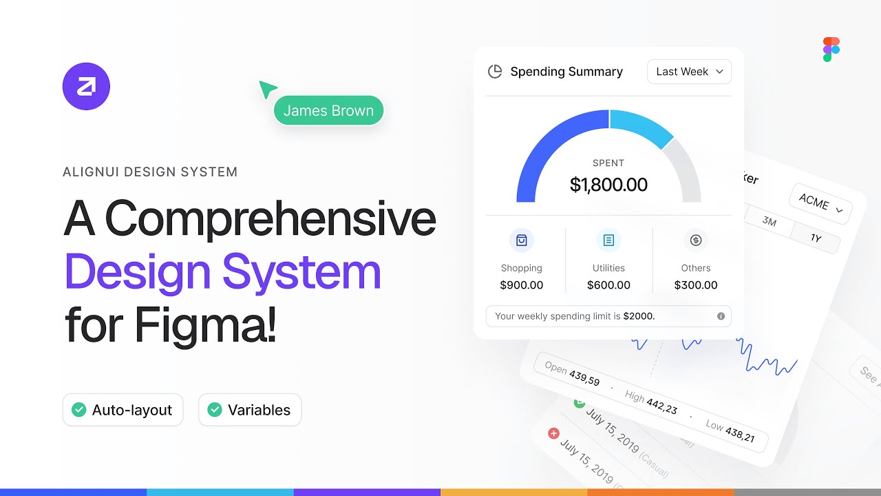
AlignUI design system is Figma-first, with a growing React component library on the code side. The Figma library includes 8,000+ components, 1,200+ assets, and 80+ unique widgets, all built with Figma Variables and Auto Layout, with real-world examples.
What you get on the Figma side:
What you get on the React side:
Pricing: Personal $119 one-time. Startups (5 users) $349 one-time. Enterprise custom. All plans include lifetime access and updates.
Best for: Designers and small-to-mid teams who need a comprehensive, sector-ready Figma system with a growing React component library.
Limitation: The React library is still maturing with 40+ free components. If you need a deep production-ready React library today, Untitled UI or shadcn/ui are stronger on the code side right now.
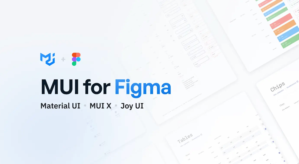
MUI for Figma is the official Figma kit for Material UI, Joy UI, and MUI X — three of the most widely used React component libraries in the world. Material UI alone has 90,000+ GitHub stars and 3M+ active users. The Figma kit is handcrafted to match the React code directly, so what you design is what you get in production.
What you get on the Figma side:
What you get on the React side:
Pricing: $79 per editor, one-time payment. 1 year of updates included. Perpetual license, download once, use forever. Renewal available at a discount after year one.
Best for: Teams already using Material UI, Joy UI, or MUI X in their React codebase. If MUI is your stack, this is the only kit worth using.
Limitation: Updates and support are limited to 1 year. After that, you need to pay for renewal to access new versions.
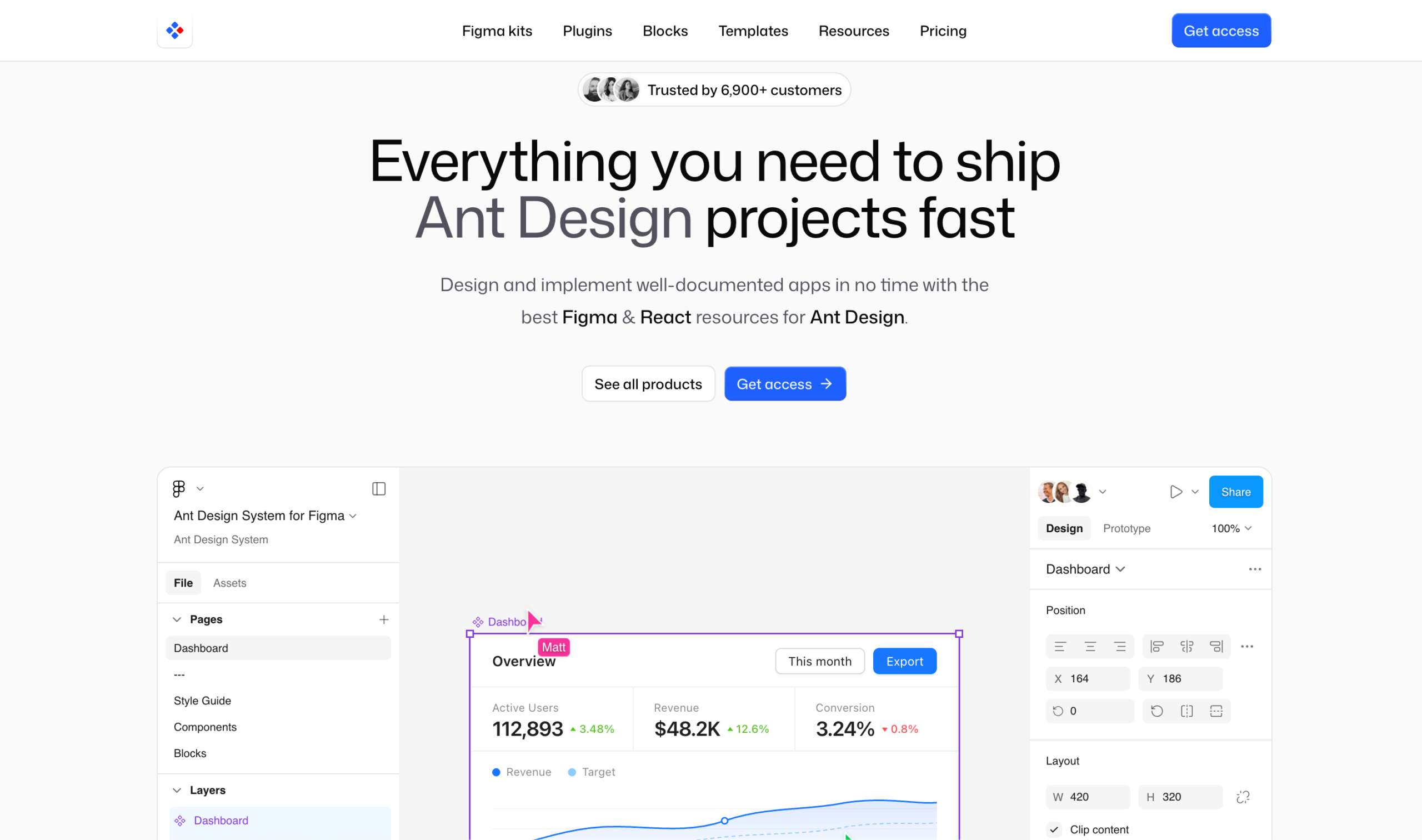
Antforfigma is the most complete Figma toolkit for teams building with Ant Design React. Started in 2019 and continuously updated by Matt Wierzbicki, it is trusted by 6,900+ customers and mirrors the Ant Design component library with 2,000+ components and blocks.
What you get on the Figma side:
Two standout plugins included (Ultimate Bundle):
Pricing (Personal license, one-time):
All plans include lifetime access, unlimited commercial usage, and free updates.
Best for: Teams shipping Ant Design React apps who want zero gap between Figma design and production code.
Limitation: Independent project, not officially affiliated with Ant Design Team or Ant Group. Ultimate Bundle at $549 is a significant investment for solo developers.
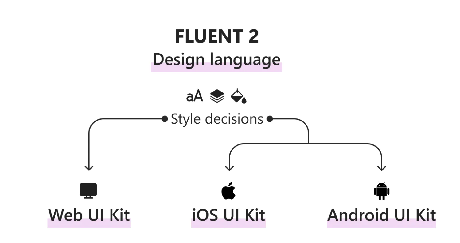
Fluent 2 is Microsoft’s official design system, built in Figma and maintained directly by Microsoft. The Figma UI kits map directly to the Fluent UI React code libraries, giving you seamless design-to-development handoff out of the box. It powers Microsoft 365, Teams, Azure, and Copilot experiences.
What you get on the Figma side:
What you get on the React side:
Pricing: Completely free and open source.
Best for: Teams building apps inside the Microsoft ecosystem, Teams integrations, M365 extensions, Azure Portal UIs, or any product that needs to match Microsoft design standards.
Limitation: Niche use case. However, if you are not building for Microsoft platforms, the design aesthetic is too Microsoft-native to repurpose for a general SaaS product.
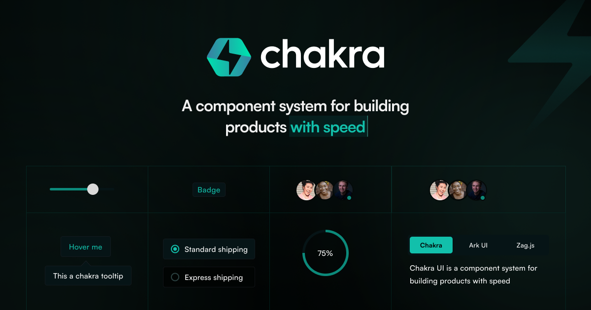
The Chakra UI v3 Figma Kit is the official kit from the Chakra UI team, available for free on the Figma Community. Every component in the kit reflects how Chakra UI works in code, so design decisions translate directly into production React components without any translation work.
What you get on the Figma side:
What you get on the React side:
Pricing: Completely free, official kit from the Chakra UI team.
Best for: React teams already using Chakra UI v3 who want their designers and developers to work from the same component language.
Limitation: Only valuable if your stack uses Chakra UI. Outside of that, better free options exist on this list.
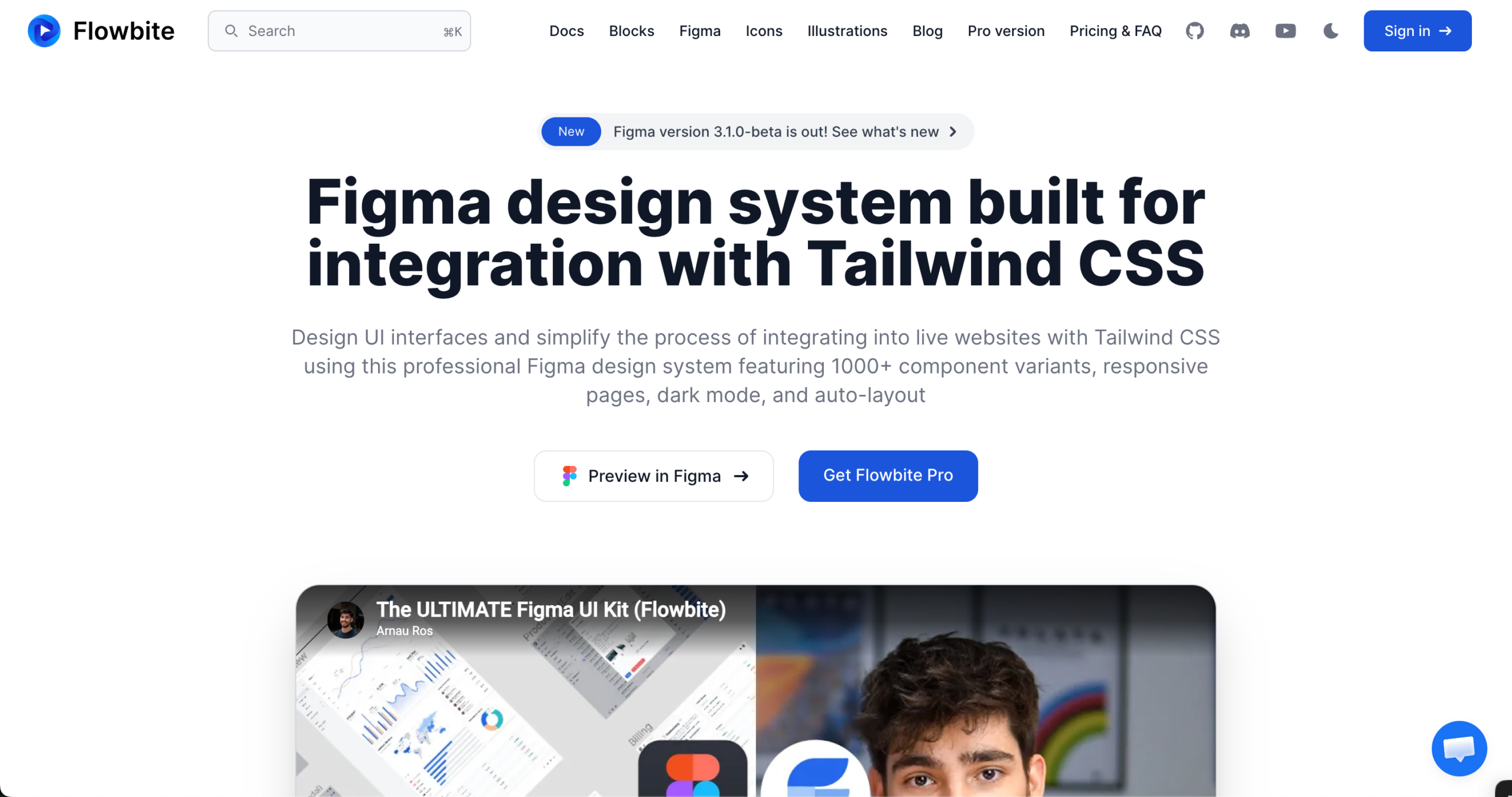
Flowbite is built entirely around Tailwind CSS utility classes. The Figma design system and the React component library speak the same language, use the same tokens, have the same naming, and share the same structure.
What you get on the Figma side:
What you get on the React side:
Pricing:
Best for: Tailwind-first React teams building SaaS products, landing pages, or e-commerce apps who want design and code to share the exact same token values.
Limitation: Not a full design system in the traditional sense. No dedicated React component library shipped as a standalone package. Best used when your team is already committed to the Tailwind CSS ecosystem.
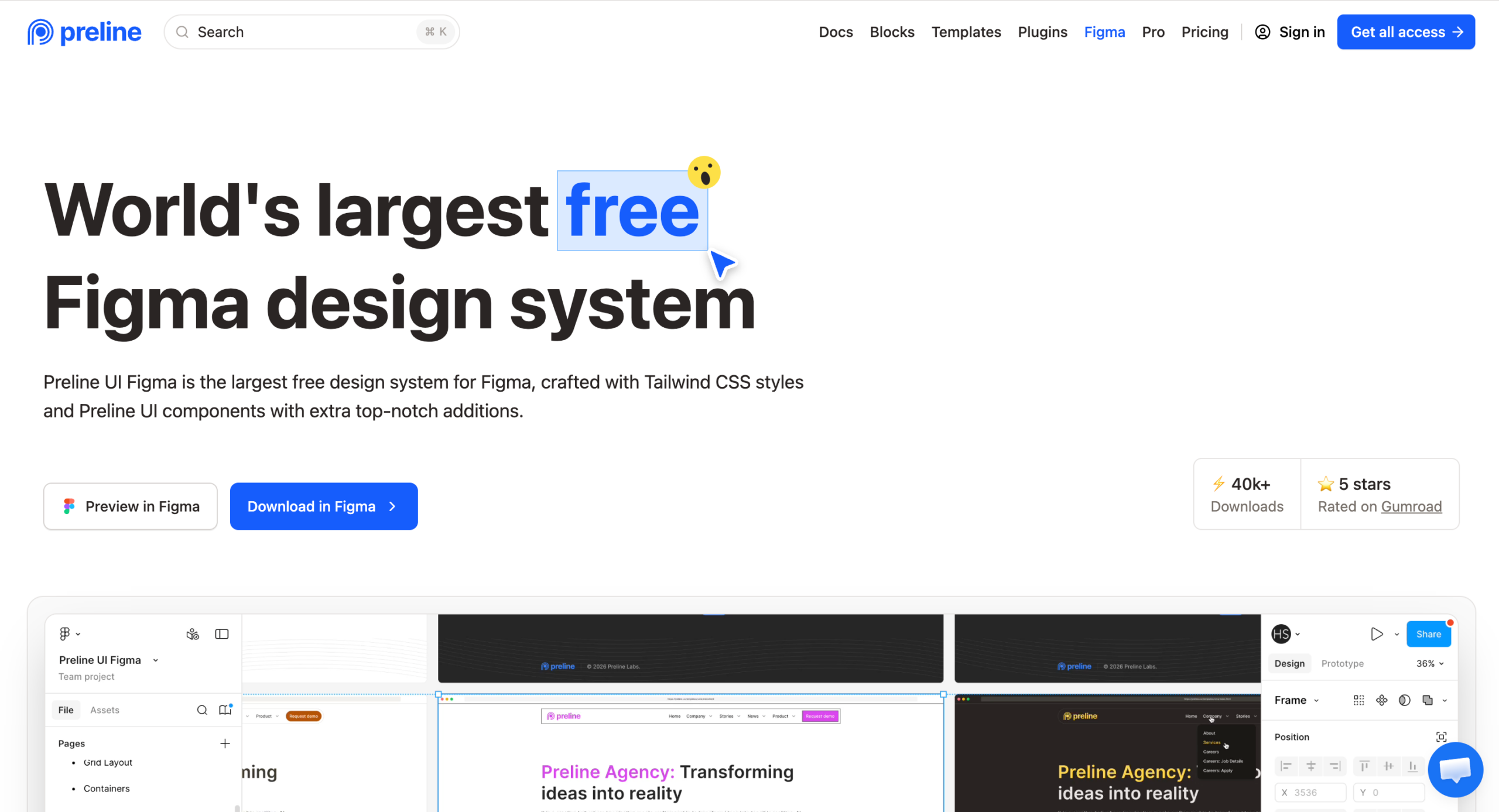
Preline UI Figma is the largest free design system for Figma, built around Tailwind CSS styles and Preline UI components. With 40,000+ downloads and a 5-star rating on Gumroad, it is one of the most downloaded free kits available right now.
What you get on the Figma side:
What you get on the code side:
Pricing: Available for free on Figma Community and Gumroad. Licensed for personal, commercial, and client projects.
Best for: Tailwind-first teams who need a massive, production-ready free design system. Best value-for-cost kit on this entire list.
Limitation: No dedicated React component library shipped alongside the Figma kit. The code side uses Tailwind CSS, an HTML-first framework, with a framework-agnostic architecture.
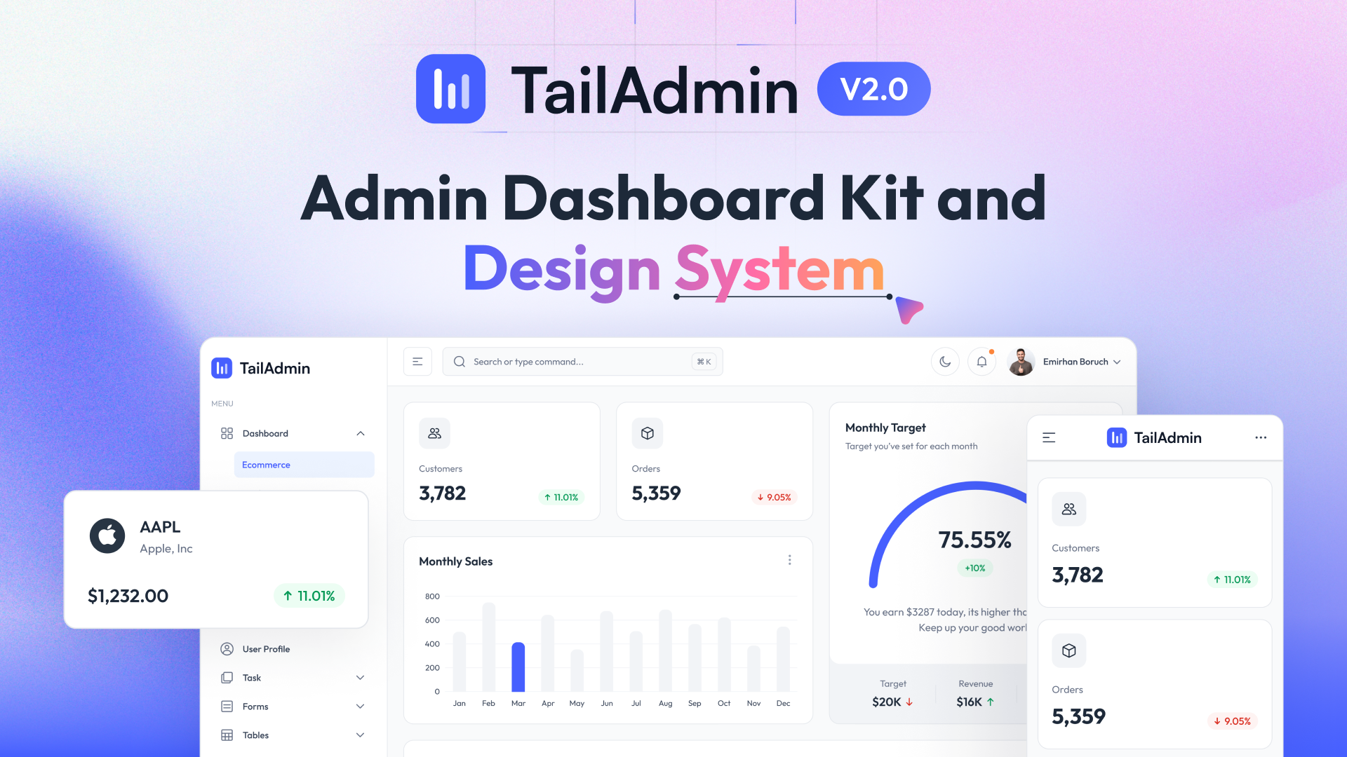
TailAdmin is a free, open-source admin dashboard design system built for Tailwind CSS. It is the only kit on this list built exclusively for admin panels and dashboards, and it ships a free React component library alongside the Figma file.
What you get on the Figma side:
What you get on the React side:
Pricing:
Best for: React and Next.js teams building admin dashboards, internal tools, and data-driven back-end interfaces who want a free starting point with a clear Pro upgrade path.
Limitation: Dashboard-only focus. Not a general-purpose design system. If you need components beyond admin UI patterns, you will need to supplement with another kit.
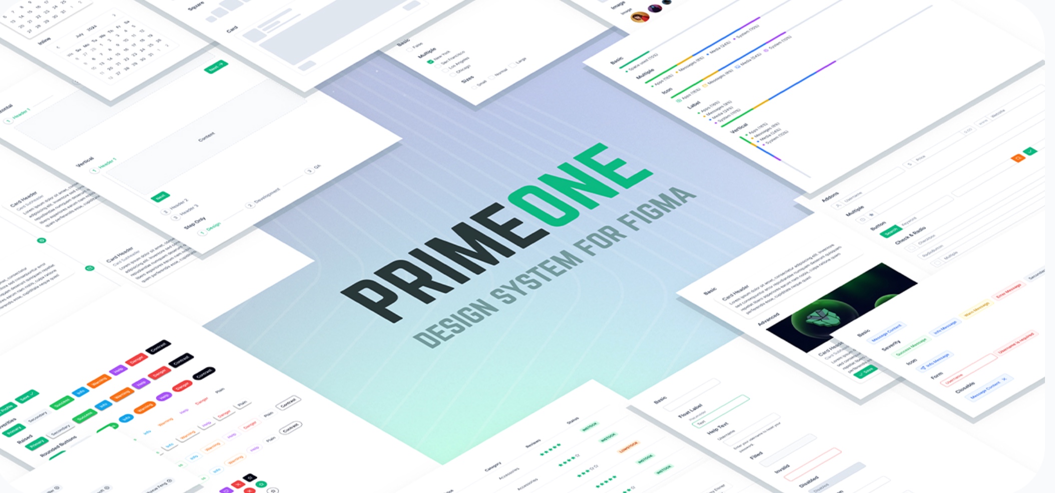
PrimeOne for Figma is the official design kit for PrimeReact, one of the most component-rich React UI libraries available. If you are building complex, data-heavy interfaces, dashboards, data tables, charts, and org charts. PrimeReact offers more components out of the box than any other product on this list.
What you get on the Figma side:
What you get on the React side:
Pricing:
Best for: Teams building complex, data-dense React applications where component depth matters more than design flexibility.
Limitation: No technical support included. PrimeTek expects users to have the technical knowledge to implement independently. Community support via Discord and Forum only.
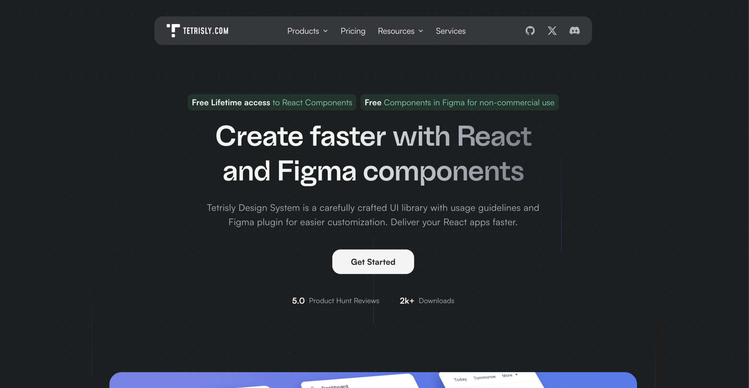
Tetrisly is a carefully crafted design system built by VirtusLab, founded in 2019. It ships both a Figma component library and an open-source React library that are fully consistent with each other. The same terminology, structure, and tokens on both sides, no translation work between design and code.
What you get on the Figma side:
What you get on the React side:
Pricing (Figma):
React library: Free and open source, no license required.
Best for: Product teams who want token-driven design-code consistency and need both a Figma system and a React library maintained with the same structure.
Limitation: Subscription-based pricing for Figma commercial use. Smaller component count than Untitled UI or PrimeReact. Best suited for teams who value quality and token depth over raw component volume.
The best Figma UI kit is not the most popular one. It is the one that matches your React stack.
Here is a simple decision framework:
One principle covers everything: a beautiful Figma kit that doesn’t align with your React stack creates more work than it saves.
You now have everything you need to make the right call.
Thirteen verified kits, pricing, limitations, and a clear match to your stack.
Here is the only thing left to do.
Match your kit to your React stack. If you use shadcn/ui, grab the free community kit today and test it on one real component. MUI, then open MUI for Figma and duplicate the community file. Tailwind CSS, Tailgrids UI, Flowbite, and Preline are all free to start. If you want the most complete general-purpose system, Untitled UI has a free tier.
In short, do not spend another sprint manually translating Figma colors into Tailwind tokens. That problem is solved. Every kit on this list solves it, so pick one and start.
The best Figma UI kit is the one your team actually ships with.
Join or community and get help according to your needs.