Cart is empty
Looks like you haven’t added anything to your cart yet
Cart is empty
Looks like you haven’t added anything to your cart yet

In this post, you will learn to create a successful landing page from scratch. You may be the one who has gone through several online articles before settling on this one.
Perhaps you are a professional who’s failed on all your previous attempts on designing a perfect landing page. We don’t keep any assumptions on who you are. Our only advice is that you start from SCRATCH.

According to forbes magazine – “A startup is a company working to solve a problem where the solution is not obvious and success is not guaranteed,” says Neil Blumenthal, cofounder and co-CEO of Warby Parker.
I think, we will not need to explain the same thing again and again. If your product is SaaS mobile app which is uncertain about its business it’s also a startup. Startup and SaaS are connected with each other but not the same.
It is mandatory that you learn the basic definition of a SaaS. It’s not like you didn’t know that, but remember when we said ‘Scratch’.
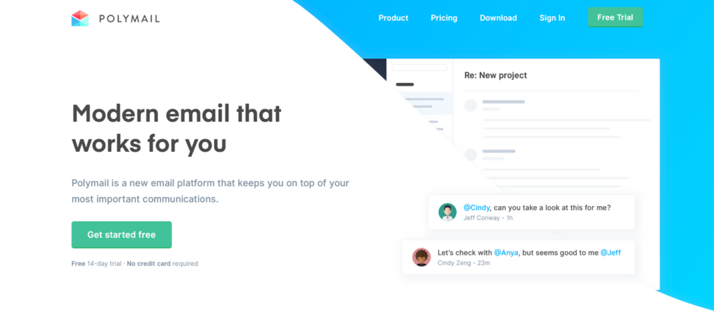
A SaaS software hosted on a server for anyone to use it without having to install them on their devices. Well, we have been using them for a long time for various purposes. Say, Gmail. It is software as a service provided by Google.
Well, there are three categories of cloud computing. SaaS, P(latform)aaS, and I(nfrastructure)aaS. We don’t have to dive into those topics. Just keep in mind that cloud computing is the future, and SaaS is growing way faster than we think.
You are all up for creating a Startup or SaaS landing page; a page that converts. Before proceeding into the process after munching on a few how-to articles here and there, you should be aware of the chances of your page descending into the inevitable dead pit where there is, literally, a strong repulsion for conversion.
The problem with most people who are designing a SaaS landing page is that they do not have an end goal. An end goal defines how your landing page is going to be presented in front of the prospects. Without that, no matter how meticulous the structure could be, you would never have people click on that fancy signup button. Because you have obviously not included what could have been the crucial element for conversion. Because you didn’t have an end goal. And the articles and guides you read online wouldn’t tell what your end goal is.
Well, a user is a prospect who might reach you from anywhere. He might be someone looking for an easy drag and drop website builder for his new book store. He would Google it, and if your SEO is better enough, he might land on your site’s landing page.

Now you got only a few seconds to convince him to stay and explore your site. That’s what a perfect landing page do first; make them stay for an extra while.
The conversion process comes after that.
Let’s say, you have landed on one of the Zoho’s products page and let’s assume that it is not some reputed brand, and you have reached there through Google’s search results.

You have obviously landed there with a sound knowledge of what you want. Now the question is, what’s your first impression? Are those bold intro words make you want to explore further? Is the first impression captivating enough?
These are the questions you should ask yourself when you create a landing page for a product no matter whether it’s popular or not.
“The users come with a goal, and you should promise them to fulfil that within the first few seconds”
When the user is convinced to explore the page further, there are only a few things you want them to do. In fact, there is only one thing you want from them – conversion.
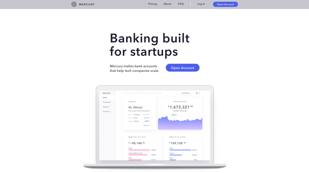
1. If you are providing banking related service, you will want them to open an account.
2. If you are having a convincing product, you will want to hook them up with the free trial.
3. Well, if you write a blog on a particular niche, you will need your readers to subscribe to a newsletter.
4. You can even put up a product for pre-order, and calculate the viability of the business.
Whatever the service could be, you just want them to buy it from you. A single purpose. Your entire page design should satisfy that purpose.
A landing page should cover whatever the doubts a user might have initially, and make them perform an action. Keeping that in mind, you should also know that there is no particular rule on the design of a landing page.
Perfection lies where the details are. You are walking them through a particular service, so each and every element in the page should collectively create an ambiance that would encourage the user to proceed further.
Still, there are a few common elements that you would find on every successful landing pages. (Apart from the header, and footer)
Whatever you do with these elements speak a lot about how efficient marketer you are.
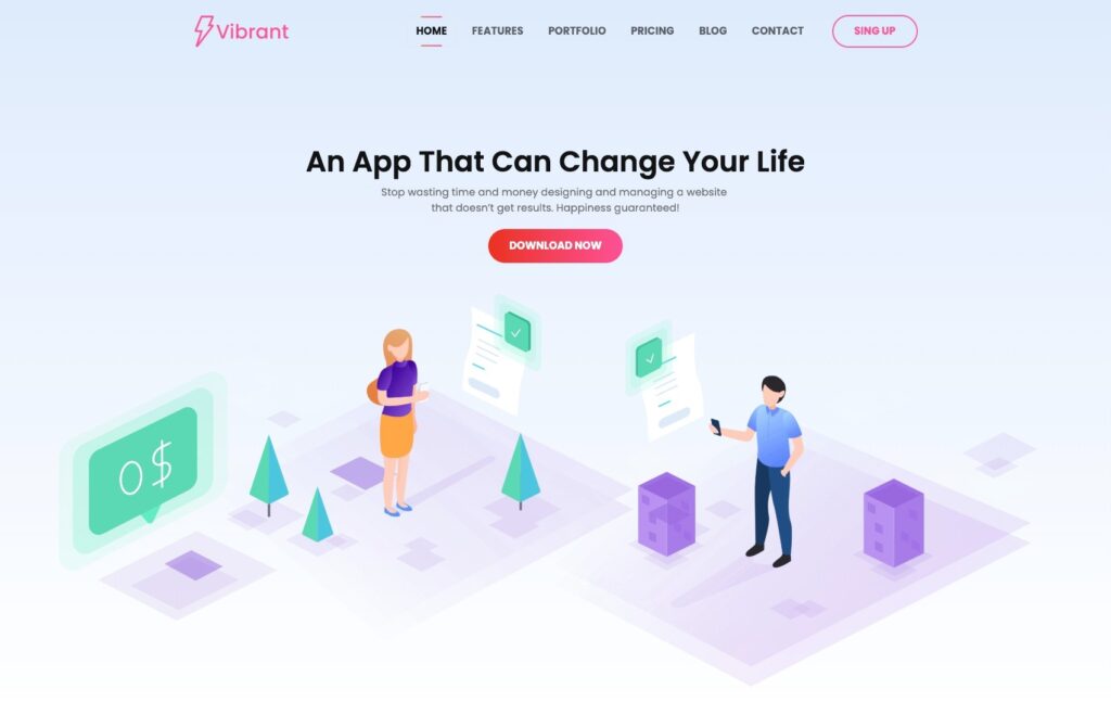
According to Neil Patel, the value proposition has a great impact on the conversion rate. The product or service you promise should stand apart from its competition. Even though it is not, the intro should say otherwise. You are not lying, you are just luring them into the further part of the page that would convince them where you are better than your competitors.

The headline should be grammatically perfect and speak what needs to be spoken. The single line should tell the users what the website is all about. There is practically no need for you to be mysterious in this part or any part for that matter.
The subheading is not always necessary in an intro, but it is definitely not an unnecessary part. It depends on the headline. The intro could have an explainer video or an image where the need for subheading becomes redundant. In general, the subheading should emphasize the goal which is already mentioned in the headline.
For example, the headline can be a question on a particular problem, and the subheading will be the answer to that question.
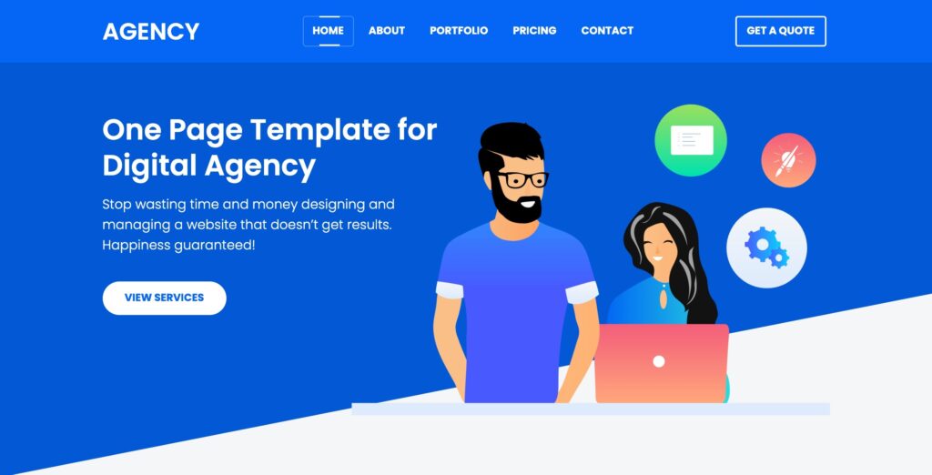
An image that directly defines the product or a short explainer video will immediately grab the attention of the visitor. Again, it is not a mandatory part.
Though the odds of the visitor immediately clicking the CTA button above the fold are high, it is not impossible. We will discuss the CTA buttons later in this guide.
After the intro, a landing page should contain the details on point about the product you deliver. Just because the visitor is convinced with the intro (above the fold), you cannot assume that he’d be sold on the idea of your project.
According to Impact, the average conversion rate of a landing page falls just above 2%, and the top 25% sites only reach 5% and little above. Even the top 10% sites could reach only up to 11.45%. Now you get the picture right? It is never a piece of cake. If you are reading this, then we can easily assume that your primary goal will be to touch the average. You can even target the 11% mark if you take each, and every line in this guide seriously.
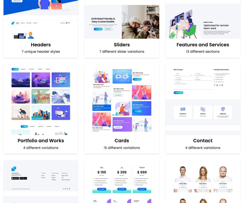
You can take our landing page as an example. We have listed the key features of site philosophy in a box like presentation. You could just see them and know what the fuss is all about.
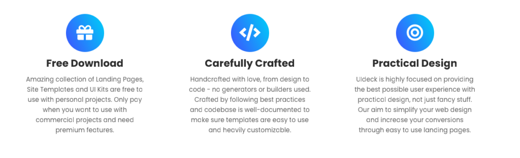
Your product might have dozens of features. Listing them all in your landing page will only confuse the visitor and the main feature of the product will hide in the crowd. The next step of the visitor will be to click on the browser’s back button and explore other search results. You don’t want that.
“Just give them enough. Nothing more. Nothing less.”
Go through landing pages of famous sites, observe their designs, and take inspiration from them. One cannot always come up with new designs and believe that they would work.
Then comes the interesting part.
Say, the customer is mind-blown with the features, and benefits of your product. But, he/she hasn’t tested it out yet. Well, they can opt-in for the free trial (considering you’ve provided that). But, what are the odds? At this point, they would want to know who else is using the same product or service. That’s where the validation part comes in.
The clients and testimonials could do the job for you. Visitors would want to know the viability of the product so that they can feel secure with the investment.
What if you are just starting with literally zero customers? You can directly reach out to potential customers and offer a free trial of your service. You can even offer your product for free of cost, so that you can earn social proofs that, in turn, would garner a lot of customers for you in the future.
Keep in mind that you should only display testimony of people who matter. Your friends’ comments can never be a part of your landing page’s testimonials.
Then comes the most important part of your landing page. Making the visitor interact with you.
You can be successful in getting the user excited about your product. But, you should never forget that the period of excitement is ephemeral, and would barely last for seconds.
You should make use of that fleeting seconds to get input from that visitor. Beat the iron when it is hot. A perfect CTA button would do that job for you.
There are a few important CTA points – if followed – would result in winning a click from the visitor.
Ex. ‘30 days free trial.’, ‘No credit card required’, ‘Download for free.’

A header should contain the logo, navigation links of the site, and even a call to action. You should not complicate the header with the secondary links like social media URLs, company details, newsletter, etcetera. They are bound to be positioned on the footer.
It doesn’t mean you can dump dozens of links on the footer. Just keep the necessary links neatly organized so that the visitors don’t have to scrutinize to identify the link they want.
We hope that you are getting away with enough knowledge to build your next viable landing page. Best of luck on that part. We have also included some links scattered amidst the guide so that you can garner additional knowledge. Thanks for reading.
Join or community and get help according to your needs.